tessl - home moving app
Imagine being able to complete the whole moving process in a matter of weeks rather than months. Picture being able to see exactly where you are in the process, at any moment in time; day-or-night. That sums up the ambition of the team working on the ‘tessl’ home moving app.

Following a period of competitor and comparator research, I held a brand definition workshop to ascertain the start-up brand’s vision, goals and brand personality (archetype).
This went on to inform the choice of name, colour palette, typography and illustration style.
Brand definition
Mapping, wireframing, prototyping
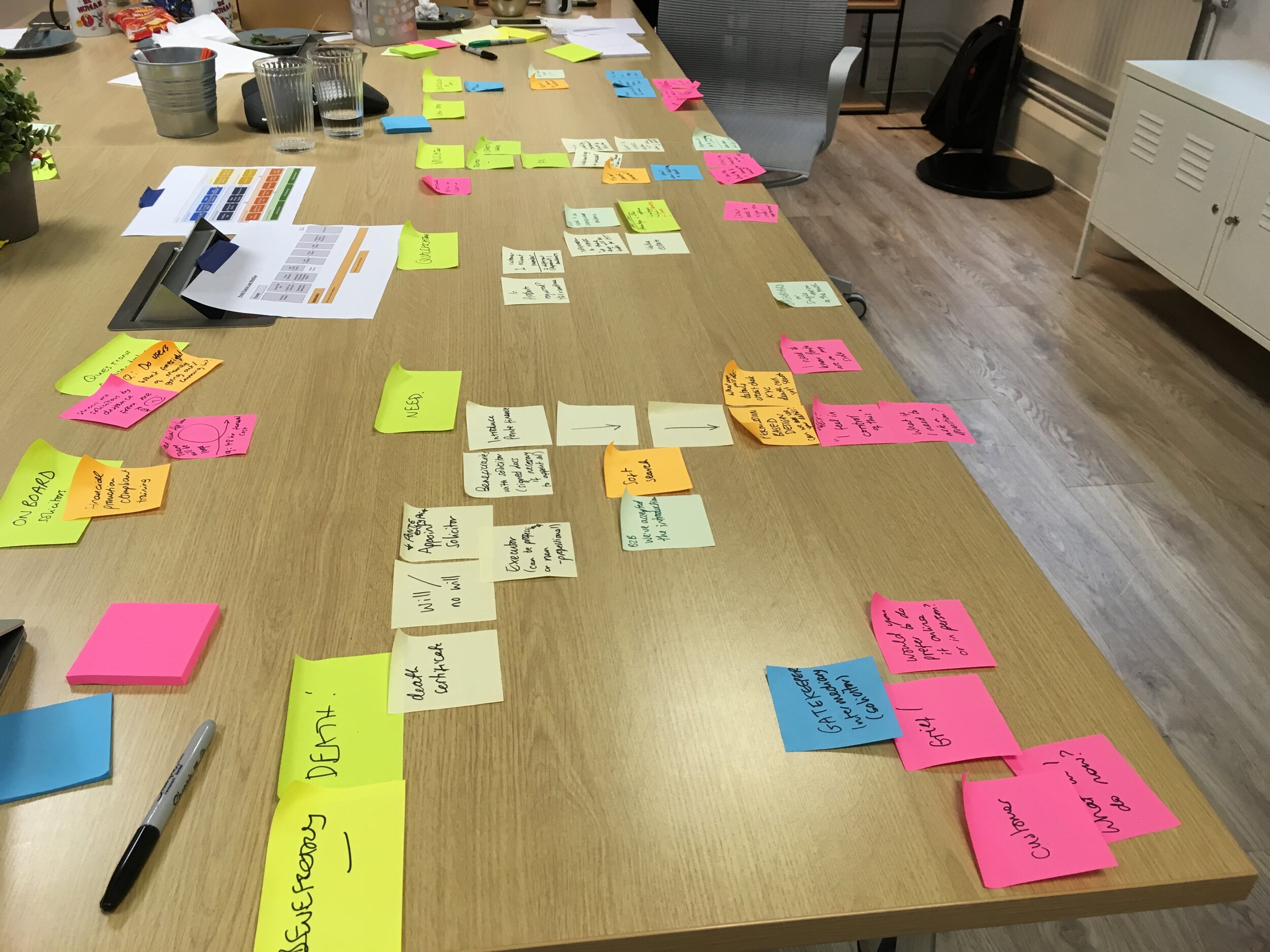

I worked alongside another UX Designer to draft user journeys and wireframes detailing how we envisaged the app working. These were taken into user testing in the form of low fidelity prototypes before being tested with users and refined.

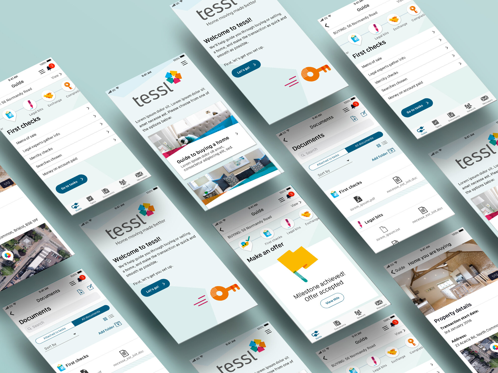
Once we had a working prototype that performed well in testing, we moved on to UI design. I developed a style that echoed the newly defined brand, whilst allowing the content to take centre stage.
UI design

Using a series of steps and stages, the app design demonstrated to users where the property sale/purchase (or both!) was making progress, and what tasks were outstanding, allowing them to take action and keep things moving.
Supporting microsite and over-arching style guide
Supporting communications
In order to test appetite with other businesses involved in home buying and selling, the team and I worked on a secure microsite.

Defining patterns for the future
Since ‘tessl’ was an entirely new entity, I created a light-touch brand guidelines document detailing how the brand should be brought to life in different scenarios.
